Postmodernism
Society has begun to loose confidence in life and new technology that was to create beneficial change. “The new big idea was no longer impressive” (www.visual-arts.com) art was now under pressure not to fail to attract to the masses. However McCoy states “ we are witnessing the end of an era of mass communication and the beginning of another. Subculture instead of mass culture and tailored products instead of mass production” The postmodern era was now a time to design for a specialist audience tailoring it on factors such as culture, taste, and fashion. Postmodernists accept that art is subject to change depending on time and place also.
Skills were now more of an asset than knowledge. It was now more useful for the artist to apply mastered production techniques as opposed to “learning tradition of their skill” (www.visual-arts.com) Individual creativity and interpretation being key. Consumerist power ever growing means artists could now utilize the invention of new image based technology the television, computers, and the Internet, generating a huge influx of film and photographic imagery of places, sites and events.
Wolfgang Weingart


“It seemed as if everything that made me curious was forbidden: to question established typographic practice, change the rules, and to reevaluate its potential. I was motivated to provoke this stodgy profession and to stretch the typeshop’s capabilities to the breaking point, and finally, to prove once again that typography is an art” (Wolff, 2000, 112)
He would experiment witch stacking of images, text, and textural effects but maintain that typography should have a hidden structure and visual order. Weingart produced a new wave of typography questioning the before known formal way type appeared on the page. He introduced the use of the indent in the paragraph and wide letter spacing successfully expanding typographic communication with his experimentation.
Chuck Close

Big self portrait, in black and white
The invention of photorealism, the new method of representation of an image. Close’s method was to use a grid technique in order to enlarge a photograph, each section of the grid becoming its own piece of art. close used accryllic and airbriush t gain every detail. He pays accute attention to detail with regard to shadow and highlight he also became fascinated by “how a photograph shows some parts of the image in focus, or sharp, and some out-of-focus, or blurry.”(www.artsconnected.org) and having to potray this in his enlarged image.


Kiki
Close had to adapt his style after 1988 where he began to paint tight shapes within the gridded squares creating a unified image when viewed from afar. A style “similar to technique used by the Impressionists and Pointillists.” (www.artsconnected.org)

Warhol Dollar bill 1981
One of his signature silk screen paintings to grace the postmodernist era. the designer decade the time for individual goods. postmodernism “became the preferred style of consumerism and corporate culture”(www.vam.ac.uk) Societies fatal encounter with money could it last? do we still live in a postmodern time? We still have the need for commodity and individual taste it is now good to stand out and embrace something different and that stands out. We now still aim to upset established thinking and embrace history and fight for the decorative.
Bibliography
Image sources
- http://www.andywarholgallery.com/products/Andy-Warhol-Rows-of–Dollar-Bills–c.-1980’s.html
- http://www.artsconnected.org/artsnetmn/identity/close.html
Online Sources
- http://www.artsconnected.org/artsnetmn/identity/close.html
- http://www.vam.ac.uk/content/exhibitions/postmodernism/about-the-exhibition/
Text sources
- K.Wolff Wolfgang Weingart, My Way to Typography, lars miller publications, 2000
Art Decco
“Art Deco’s ultimate aim was to end the old conflict between art and industry, the old snobbish distinction between artist and artisan, partly by making artists adept at crafts, but still more by adapting design to the requirements of mass-production.”(http://www.allaboutdeco.com/).
Art deco famously named following an exhibition entitled Les Années ’25, in Paris. The exhibiition was said to be distinctive from previous international exhibitions for two reasons. “For the first time, the decorative and applied arts held center stage.” And “ The criteria for inclusion in the Exposition also emphasised the modern,” (www.vam.ac.uk, 2012)
The architecture and decorative arts were influenced by a range of styles including “a modern interpretation of the 18th-century style of Louis XVI (reigned 1643–1715), seen as the golden era of the French decorative arts” (www.vam.ac.uk) aswell as influence from Cubism, expressionism, futurism and vorticism and ancient Egyptian art” (Hillier 1968, 26).
Unlike the other art movements based on social philosophies and manifestos, Art Deco was purely decorative Another new modern style, responding to the machine and new materials but this was a luxury style, producing luxury goods for wealthy consumers.


Art deco also had a huge affect on the decorative arts in America introducing curves and streamlines “Art Deco began as a “smart” urban style in the United States, the latest fashion among a small contingent of upper-middle class sophisticates” (Gebhard, 1996, 8). However progressively the new found decorative style was said to be applied to the design of “cars, architecture, furniture and mass-produced goods such as refrigerators and radios.” (www.vam.ac.uk) Reaching the 1930s this was to reach new consumers on different wealth levels leading to mass consumption of affordable goods.
The Chicago Board of Trade – 1930 by Holabird and Root

The Chicago Board of Trade – 1930 Holabird and Root

Chrysler Building, New York: Manhattan – 1930 by William Van Alen

The Guggemheim Museum, New York: Manhattan – 1942-1959 by Frank Llloyd Wright
Art deco architecture is recognisable thanks to its distinct geometric and decorative look. “Art Deco is characterized by a linear, hard edge or angular composition, often with a vertical emphasis, and highlighted with stylized decoration” (Blumenson 1977). While being decorative, it remains simple with emphasis upon symmetry and clean lines and no complicated shapes.
Art deco represented something for everyone and “reflected the human need for pleasure and escape” and succeeded in”creating a mass style of permanence.” (www.vam.ac.uk) permanent to this current day. A society now excited by the ability to purchase for social purpose and for individual taste. The era allowed for exclusive work being produced affordably allowing all levels of society to purchase. Art deco “celebrated the fantasies, fears and desires of people all over the world.”(www.vam.ac.uk)
Bibliography
Image sources:
- http://www.destination360.com/north-america/us/new-york/nyc/guggenheim
- http://www.archdaily.com/98222/ad-classics-chrysler-building-william-van-alen/
- http://designslinger.com/2012/10/03/chicago-board-of-trade-building.aspx
- http://pinterest.com/sandymaree/art-deco-1920-s-1930-s/
Text sources:
- Blumenson, John J. G. Identifying American Architecture: A Pictorial Guide to Styles and Terms, 1600 – 1945. Nashville: American Association for State and Local History, 1977.
- Gebhard, David. The National Trust Guide to Art Deco in America. New York: John Wiley & Sons, Ic., 1996.
- Hillier, Bevis. Art Deco. New York: Schocken Books, 1968
Online sources:
- McGuinness, Beryl.2000. http://www.allaboutdeco.com. (accessed 10/1/13)
- http://www.vam.ac.uk/content/articles/a/study-guide-art-deco/ (accessed 14/1/13)
- Exhibition “Art Deco: 1910-1939” March – July 2003 http://www.vam.ac.uk/content/articles/a/art-deco/ (accessed 14/1/13)
The 50’s and 60’s
The 50’s and 60’s witnessed the growth of the need for advertising due to the natural rise in consumption. Socially speaking commerce allowed for individuals to create an identity for themselves and advertising allowed society to foster the idea of an “imaginary state of well being” defined by income.
Within Europe and America there was a philosophical debate about old and new ideas and the nature of human experience. Artists had to now take on the role that their art could respond to the social progress that was being made. Advertising was of the most obvious response. David Klein demonstrates this point with some of his work.


The American illustrator created a number of travel posters for “Howard Hughes” Transworld airlines in the 50’s and 60’s. Klein uses Iconic landmarks and scenic images to advertise global travel. The wild color schemes and abstract lines makes you want to travel through the happy space, shape and colors.
It is also easy to see that Hockney demonstrated the use of bright vibrant block colour and expressed his huge interes in California in a lot of his work.


Designers now influenced by European immigrants between he wars saw the rise of asymmetrical compositions, mechanically produced images and new typographic systems and eh use of white space.

David Hockney: Pearblossom Highway.
This photographic collage “using over 700 photographs” is a unique interpretation of a California road. The perspective allows the viewer to have an insight into the driving experience he wants to communicate both driver and passenger eye view. On the drivers side the road signs and stop keeping the driver alert and on the left the passenger can see the desert a relaxing calming view. Getty museum director stated “Hockney has manipulated scale to make the picture work better, to make it more real. It’s more real than any view you can have standing there in the desert. That’s what hits you in the stomach.” (article, L.A Times)
Alexander Brodovitch: His design career said to of flourished in 1924 after his poster design for Le Bal Banal.


Alexander Brodovitch
Widely known for his contribution to contemporary magazine design while art director of Harpers Bazar. Some may say he is a pinnacle in the Graphic arts who belived in “visual vitality and immediacy” (history of visual communication 2013) His fascination with photography and layout and his new approach “became the dominant photographic style of the 1950’s”
During the 50’s Brodovitch now possessed a style of combining text and photography with large amounts of white space. Although his style is so distinctive he never formulated a layout theory he merely stated “there is no recipe for good layout” instead you should “change and contrast. A laout should be simple with good photographs” (Raimes and Bhaskaran 2007)
Bibliography
Image sources
- http://www.aaronartprints.org/hockney-pearblossomhighway1118thapril1986no2.php
- https://www.lamodern.com/featured-artists/david-hockney/
- http://www.davidkleinart.com/Travel_Posters/Pages/Vintage_TWA_Posters.html
- http://www.citrinitas.com/history_of_viscom/modernists.html
- http://www.iconofgraphics.com/Alexey-Brodovitch/
Online Sources
- L.A. Times’ article entitled “Hockney Makes an Inroad with Pearblossom Hwy” written by Suzanne Muchnic. Found at http://www.aaronartprints.org/hockney-pearblossomhighway (Accessed 20/1/13)
- http://www.citrinitas.com/history_of_viscom/modernists.html (Accessed 21/1/13)
Text Sources
- Retro Graphics, a visual source book to 100years of design, Johnatan Raimes and Lakshmi Bhaskaran United kiNGDOM 2007 Ilex Press ltd
The Cold War
Years of political and economic conflict along side military tension between the communist world (the soviet union) and the western Capitalism. Each side seeing themselves as self determined rational and peaceful and their opposition as agenda led manipulative and dehumanizing. This gave modern artists a need for revolt. They responded by searching for ways to build a new and hopeful future. searching for Utopia.

The Soviet Union was keen to promote a positive image of itself throughout the early 1970s due to the Vietnam war and tensions with America. Posters such as these helped keep Lenins political ideologies alive. There are no slogans or foreign type on the poster therefore you could assume it has been designed for a foreign audience such as american and European aswell as the main aim of the image is to encourage his constituents to remain optimistic and hold out hope for the future.
In the late 1960s, architects and designers came to reflect on the impact of the political battle on the planet. They asked themselves how can they exploit new technology for the benefit of humanity without producing inhuman effects? Coming to terms with the fact that it is merely impossible to live modern lives without spoiling out planet. Designers had to now strive to correct this.
In 1976 Dieter Rams delivered a speech “design by vistoe” when he asserted his commitment to design. We are now to take responsibility for the world around us as we have irreversible shortage of resources. Rams (1976) states “good design can only come from an understanding of people” It is said that he has almost “single-handedly directed the evolution of objective functionalism” (www.wallpaper.com) the idea that design should be innovative, functional and durable while aesthetically looking good. Ken graland would agree with Rams objective by stating we don not ” want to take any of the fun out of life. But we are proposing a reversal of priorities in favour of the more uselful and more lasting forms of communication.”
Alot of Rams well know work is that of what he has done for braun.
 Braun phonosuper sk4 1956
 Braun clock radio 1978
“Experimentation with new materials and minimalist styling brought grace and dignity to common household appliances” (www.fastcodesign.com) His objective was to design useful products which would be easy to operate. His design looks effortless and real sense of simplicity aesthetically which covers a confusing electronic design inside. He was only able to achieve this look from “rigorous tests and experiments with new materials and an obsessive attention to detail to ensure that each piece appeared flawlessly coherent.” (designmuseum.org)
Rams design existed in the post-war consumer electronics market, a time of rapid technological change. the need for development of electrical goods was at a high. Taste and style also changing vigorously “television sets had been hidden inside wooden cabinets to resemble traditional furniture” (designmuseum.org) The market was extravagant and Rams fitted in perfectly with his unique design ideas, a pinacle of the cold war.
This cold war ideologies still haunt us. The threat of nuclear warfare and power never seem distant. The intense industrialisation are more than evident in terms of our global environment. The questions that the cold war make are still apparent today. Design technology is based on the marketplace and has to keep being innovative but how can this be done without producing strain on our environment.
Bibliography
Image sources
- http://all-that-is-interesting.com/soviet-propaganda-posters-post-war-period
- http://www.fastcodesign.com/1664872/six-of-dieter-rams-greatest-hits-for-braun#2
Online resources
- http://www.wallpaper.com/design/dieter-rams-exhibition-osaka/2818, 17 November 2008 (accessed 16/1/13)
- http://designmuseum.org/design/dieter-rams (accessed 16/1/13
Bauhaus
Manifesto of the Staatliches Bauhaus in Weimar
April 1919
“The ultimate goal of all art is the building! The ornamentation of the building was once the main purpose of the visual arts, and they were considered indispensable parts of the great building. Today, they exist in complacent isolation, from which they can only be salvaged by the purposeful and cooperative endeavours of all artisans. Architects, painters and sculptors must learn a new way of seeing and understanding the composite character of the building, both as a totality and in terms of its parts. Their work will then re-imbue itself with the spirit of architecture, which it lost in salon art.
The art schools of old were incapable of producing this unity – and how could they, for art may not be taught. They must return to the workshop. This world of mere drawing and painting of draughtsmen and applied artists must at long last become a world that builds. When a young person who senses within himself a love for creative endeavour begins his career, as in the past, by learning a trade, the unproductive “artist” will no longer be condemned to the imperfect practice of art because his skill is now preserved in craftsmanship, where he may achieve excellence.
Architects, sculptors, painters – we all must return to craftsmanship! For there is no such thing as “art by profession”. There is no essential difference between the artist and the artisan. The artist is an exalted artisan. Merciful heaven, in rare moments of illumination beyond man’s will, may allow art to blossom from the work of his hand, but the foundations of proficiency are indispensable to every artist. This is the original source of creative design.
So let us therefore create a new guild of craftsmen, free of the divisive class pretensions that endeavoured to raise a prideful barrier between craftsmen and artists! Let us strive for, conceive and create the new building of the future that will unite every discipline, architecture and sculpture and painting, and which will one day rise heavenwards from the million hands of craftsmen as a clear symbol of a new belief to come.” (bauhaus-online)
Anni Albers


Josef Albers – Purposely avoided symmetry and achieved aesthetic balance by the use of opposition.


Paul Klee


The bauhaus stood out in its values and interests in commerce, industry and striving to improve the lives of german citizens. It brought together all the arts under one roof making them a strong a structure for the modernist movements, a school and collective of practice. The Bauhaus disregarded separation between the fine arts and the applies arts. The ideology is of something great but can we fight against categorisation. Even in the modern day there is separation in the way we learn and produce art. It is apparent that the future will always involve mass production rather than individual craftsmanship which is a view agreed by the bauhaus, however today individual craftsmanship shows some what importance. bauhaus sought contact with industry and their teaching of the craft would prepare for the designing of mass production.
Walter Gropius claimed “art cannot be taught, for art is not a profession”
Bibliography
Online sources
Constructivists
Who We Are: Manifesto of the Constructivist Group by Aleksandr Rodchenko, Varvara Stepanova, & Aleksei Gan (1922)
“Seeks to change the aims for artists from expressing their own vision to serving the society as a whole, whatever its needs” and it also stated “today we proclaim our words to your people in the squares and on the streets we are placing our work” (Armstrong, 2009, 22-24) art should not have an element of laziness any longer, art should not be a sanctuary for the idle. It was time for designers and artists to break away from the canvas and “renounce colour as a practical element.” They agreed that colour was accidental and had nothing to do with the inner essence of the design. They also wanted to “renounce volume as a pictorial element and form of space” and “affirm depth” Space and time are two elements that can always constrict art but not for the constructionists. It is under these elements Life is built and under this art must be constructed. Ideas crumble under the strain of ages but life is always strong, a factor guaranteed not to change or disappear. Time goes on that is fact, therefore art must stand the test of time.
Alexander Rodehenko

 Rodenhenko used photomontage as a method for his work. Essentially engaging social mobility in photography. Introducing new quirk angles in which to represent the images is very innovative and thought provoking. He stated that “one has to take several different shots of a subject, from all different points of view in different situations, as if one examined it in the round rather than looked through the same key hole again and again” Hence his theory of experimentation is the conclusion for his outstanding photography.


Rhodchenko helped mark the end of the easel painting and the end of the bourgeoisie norms and practices thanks to the russian revolution. The hope for a new life and culture. Rodehenko was one of the first to create monochrome design “reducing painting to its logical conclusion.” (www.tate.org.uk) by exhibiting 3 canvases in red, blue and yellow.
Constructionists wanted to break with the romantic past, embrace technology and functionalism and to successfully use their artistic talent “to construct” what is wanted or needed by the masses. Fueled by their admiration for industrial materials, machines and technology led to a range of materials now to be used, plastic, steel and glass to name a few.

Vladimir Tatlin: Tatlins tower
Never built but a symbol for those artists and architects inspired by constructivism. A sharp dynamic frame precisely measured with the idea of the frame encasing other buildings. The frame would have more than just one use. This idea is common ground in the present as high density cities are having to rethink structures to contain a multiple building framework and having to be innovative. This makes Tatlins Tower a strong symbol of todays architecture also.
Kazimier malevich


Malevich desired “to free art from the burden of the object” (www.kazimir-malevich.org) he did so by bringing abstract art to a geometric simplicity.
The use of artistic talent and aesthetics in order to benefit society has always been a common theme in design right up to the modern day. The use of design to effect change in our world in a common aim of designers. “the idea of social responsibility has been present throughout the pages of design history” (Armstrong 2009, 49) However the way in which this is done depends on the client, the social aim or the cause. Art is designed for social purpose and constructionists could feed on the idea that the Russian revolution allowed for a society in which materialism would become freedom.
Bibliography
Text Sources:
- Helen Armstrong, Graphic Design Theory: Readings from the field, New York, Princeton architectual press 2009
Online sources
The Futurist Manifesto
- We intend to sing the love of danger, the habit of energy and fearlessness.
- Courage, audacity, and revolt will be essential elements of our poetry.
- Up to now literature has exalted a pensive immobility, ecstasy, and sleep. We intend to exalt aggresive action, a feverish insomnia, the racer’s stride, the mortal leap, the punch and the slap.
- We affirm that the world’s magnificence has been enriched by a new beauty: the beauty of speed. A racing car whose hood is adorned with great pipes, like serpents of explosive breath—a roaring car that seems to ride on grapeshot is more beautiful than the Victory of Samothrace.
- We want to hymn the man at the wheel, who hurls the lance of his spirit across the Earth, along the circle of its orbit.
- The poet must spend himself with ardor, splendor, and generosity, to swell the enthusiastic fervor of the primordial elements.
- Except in struggle, there is no more beauty. No work without an aggressive character can be a masterpiece. Poetry must be conceived as a violent attack on unknown forces, to reduce and prostrate them before man.
- We stand on the last promontory of the centuries!… Why should we look back, when what we want is to break down the mysterious doors of the Impossible? Time and Space died yesterday. We already live in the absolute, because we have created eternal, omnipresent speed.
- We will glorify war—the world’s only hygiene—militarism, patriotism, the destructive gesture of freedom-bringers, beautiful ideas worth dying for, and scorn for woman.
- We will destroy the museums, libraries, academies of every kind, will fight moralism, feminism, every opportunistic or utilitarian cowardice.
- We will sing of great crowds excited by work, by pleasure, and by riot; we will sing of the multicolored, polyphonic tides of revolution in the modern capitals; we will sing of the vibrant nightly fervor of arsenals and shipyards blazing with violent electric moons; greedy railway stations that devour smoke-plumed serpents; factories hung on clouds by the crooked lines of their smoke; bridges that stride the rivers like giant gymnasts, flashing in the sun with a glitter of knives; adventurous steamers that sniff the horizon; deep-chested locomotives whose wheels paw the tracks like the hooves of enormous steel horses bridled by tubing; and the sleek flight of planes whose propellers chatter in the wind like banners and seem to cheer like an enthusiastic crowd.
F.T. Marinetti (Paris) Le Figaro, February 20, 1909
Marinetti began the “futurist manifesto” with stating “we intend to sing the love of danger, the habit of energy and fearlessness” summing up the futurist principles, the love of speed, technology and violence and above all the evolvement of the machine!! The industrial age fuelling their stance and allowing the opportunity to aid Marinetties revolutionary purpose. The invention of the car, the plane the whole triumph of man over nature. The aim was to introduce less fear in design, a time to embrace change and to try something new. “why should we look back, when what we want is to break down the mysterious doors of the impossible” (Marinetti 1909) The futurists chose to embrace modernisation, the noise and fast moving cities “the racers stride, the mortal leap” Society is now to be enriched by the beauty of speed and the hustle and bustle of fast paced life that we now all know too well. Rather than some fiercely attacking modern life and technology while still allowing themselves to enjoy the comforts and benefits that they bring. However as the need for speed and efficiency became a way of life can lead to closed minds, impatience and a life of laziness.
The tone of the futurists is aggressive although some say Marinetti took fascist roots so this may not come as surprising as Armstrong (2009, 43) states “ he was a nationalistic fascist so his tone can be off-putting” as well as stating that Marinetti is “clearly an unlikeable figure but his embrace of the industrial age and his printing press to spread powerful messages to the masses have served as a model for all who wish to influence the populace since” The futurists successfully achieved this by utilizing public anger and outrage toward the modern movement in order to arouse controversy and wide spread attention to their own values. To ‘swell the enthusiastic fervor of the primordial elements”
“We will destroy museums, libraries, academies, we will fight moralism, feminism, every opportunistic or utilitarian cowardice” (Marinetti 1909) destruction of the museums and artworks would mean the removal of history from modern day life. No art history would mean no inspiration. Art deserves remembrance we shouldn’t simply move with the times and forget the past. New art is needed to move with society. You simply could not make new art without having the history of art to source for inspiration, for research and above all for enjoyment.
The introduction of the machine to society lead to futurists beginning to use harsh dynamic lines into their artwork.
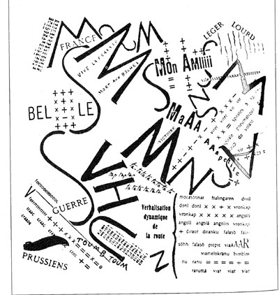
Après la Marne: This typographic piece illustrates the poem that celebrates the battle of the marne in which allies defeat Germany and established the Western front. Marinetti’s layout portrays the style of a military map. The poem “portrays General Joseph Joffre’s victorious tour of the troops after battle”(www.getty.edu)
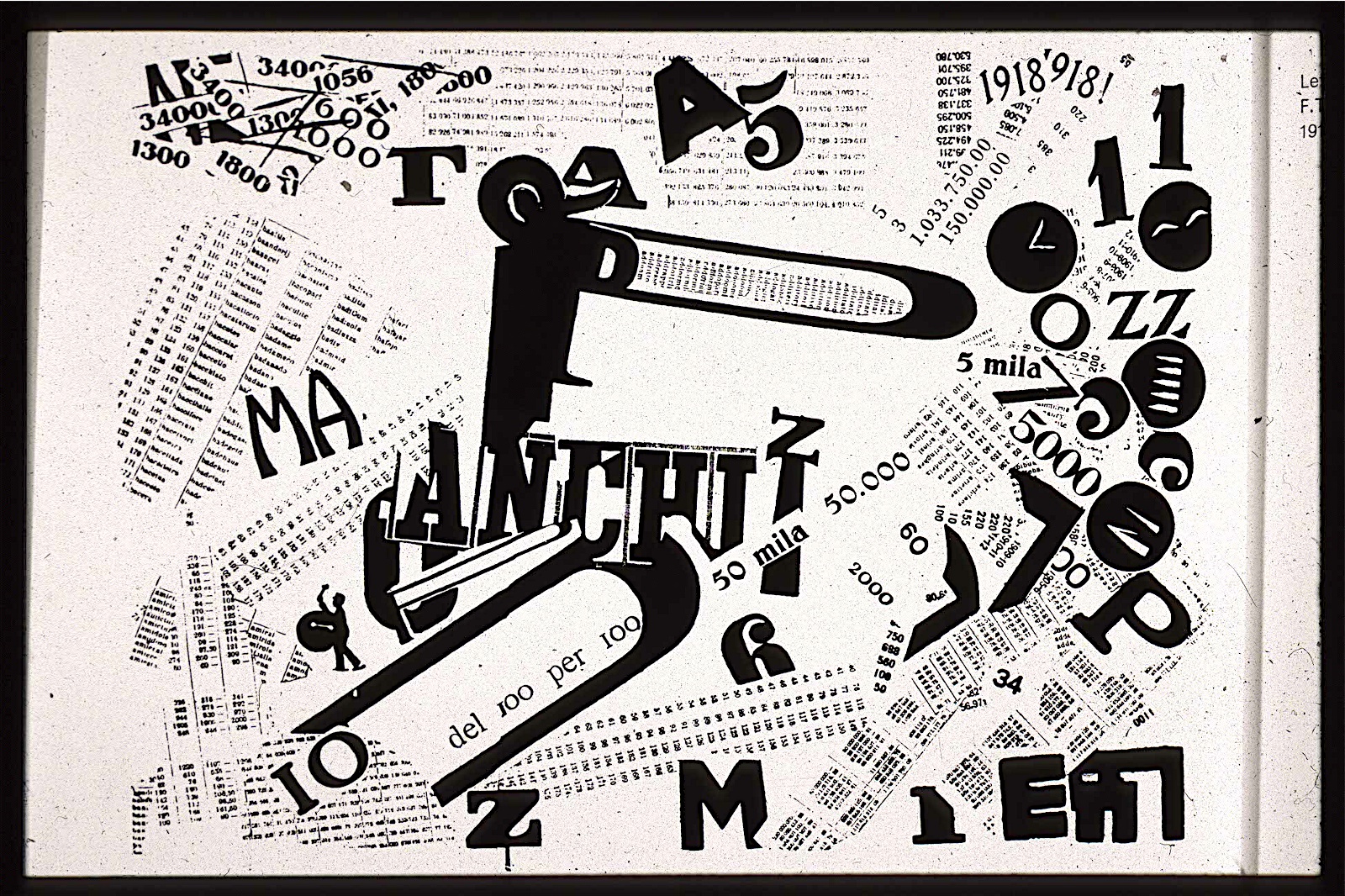
Tumultuous Assembly: Another visual poem designed to replicate world war I breaking out in Europe to capture the modern day battlefield that the futurists greeted as “crystallization of their ambitions, indeed, as the ideal expression of their cult of violence, energy and machines” (www.getty.edu) The piece looks chaotic paired with the man made sounds situated n the piece is like the emotions of war spread all over the page, suggesting a fearful negative enviroment. “The sheets of numbers evoke gatehred crowds, or the dead and missing, the latter suggested by the black clocklike shapes” Although some argue “at right, seems an abstract compostion of numbers, words and shapes, some elements suggest a celebration after world war I” (www.getty.edu)
Manifesto of the Futurist Painters (1910) Umberto Boccioni, Carlo Carra, Luigi Russolo, Giacomo Balla, Gino Severini (www.wired.com)
With our enthusiastic adherence to Futurism, we will:
- Destroy the cult of the past, the obsession with the ancients, pedantry and academic formalism.
- Totally invalidate all kinds of imitation.
- Elevate all attempts at originality, however daring, however violent.
- Bear bravely and proudly the smear of “madness” with which they try to gag all innovators.
- Regard art critics as useless and dangerous.
- Rebel against the tyranny of words: “Harmony” and “good taste” and other loose expressions which can be used to destroy the works of Rembrandt, Goya, Rodin…
- Sweep the whole field of art clean of all themes and subjects which have been used in the past.
- Support and glory in our day-to-day world, a world which is going to be continually and splendidly transformed by victorious Science.
- The dead shall be buried in the earth’s deepest bowels! The threshold of the future will be swept free of mummies! Make room for youth, for violence, for daring
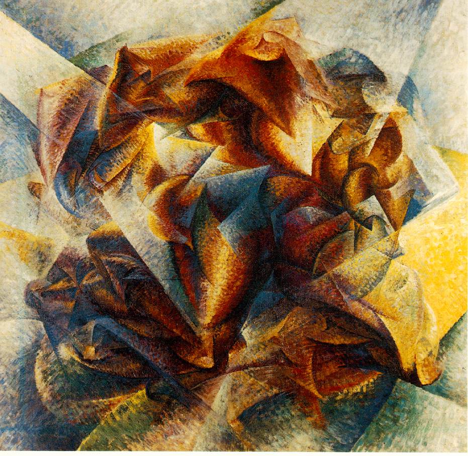
Umberto Boccioni: Dynamism of a soccer player
One of a long series of artwork of the figure in motion.“In this work a soccer player dematerializes into a luminous and flickering atmosphere, save for his firmly sculpted calf, at center.”(www.moma.org) Here Boccioni offered a demonstration of a principle he made apparent in the technical manifesto of futurist painting. “To paint a human figure you must not paint it; you must render the whole of its surrounding atmosphere . . . movement and light destroy the materiality of bodies.” Boccioni is successful in creating an atmosphere of youth and energy. This is achieved by the range of combined colours and the use of stippled brushwork.
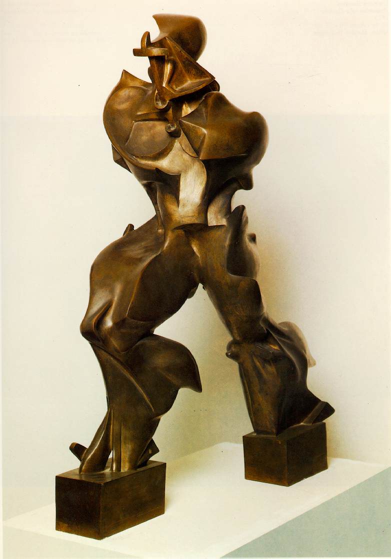
Unique forms of Continuity in space
“Sculpture,” Boccioni insisted, “should bring to life the object by making visible its prolongation into space. The confining of the enclosed statue should be abolished. The figure must be opened up and fused in space.” The bulging abstract shapes represent the muscles of the figure forces as if “under the distorting pressures of supersonic speed” The sculpture depicts strength force and violence “never before had organic velocity and energy been so emphatically expressed” (http://serdar-hizil-art.com)
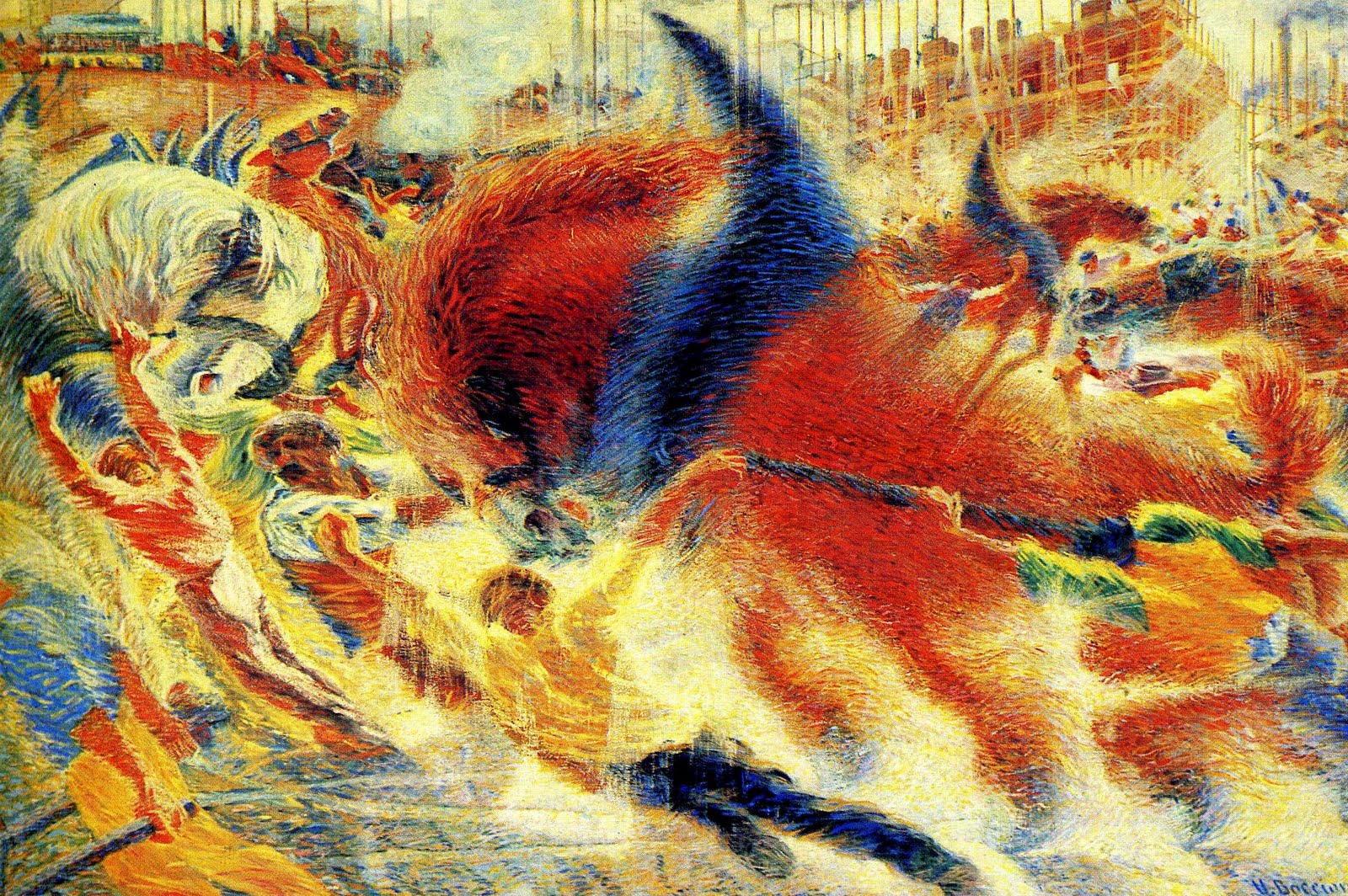
The City Rises 1910
In previous work Bocionni is seen using small dots and dashes to create texture and movement in his paintings but in The City Rises, “he tore the divisionist veil of dots into ribbons of color somewhat as van Gogh, had done in 1889 with Seurat’s Neo-Impressionist technique.” (http://serdar-hizil-art.com) The energy of the painting is successfully communicated by these quick successive brush strokes, they show the busy movement of the straining men.
It is a scene of labours of men on a construction site utilising the power of horses to their advantage. Power dominates the piece as the strong horse is the central focus. The theme is the construction of new buildings as you can see the partially built building in the top right. You can boldly see and feel the strength and energy of the piece as the use of bold dramatic colours, the colours becoming darker wen situated on the central horse, featuring none of the lighter shades that are featured elsewhere “these shadows draw the viewers eye into the painting and their mind into action.” (Widley 2010) It Creates the feeling of aggression capturing the essence of futurism. “Compositionally this painting does come across as unbalanced and discordant which could be considered a metaphor for the industrial age therefore it does capture the essence of Futurism.” (Widley 2010)
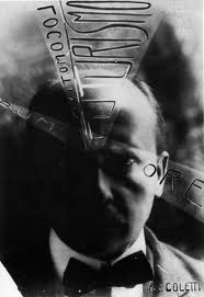
Carlo Carra
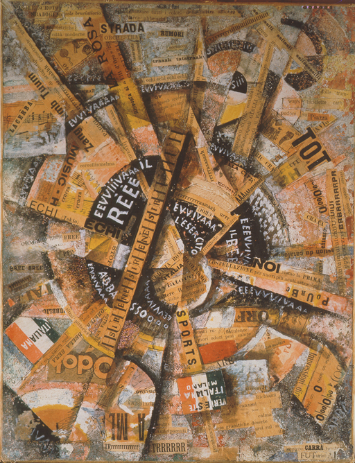
Interventionist Demonstration 1914
The collage poem has been created to distinctly move outwards from the centre in fragments of circles creating sharp ray like lines coming out from the centre along with the featured words.This gives the impression of power from the centre almost like an explosion or loud noise and the outer is the ripple effect. The use of the darker colored fragments give a sense of depth and three dimension.

Lots Daughters 1915
By 1915 Carra began to break free on the futurist movement and began to paint in a more realist style after meeting painter Giogio de Chirico. For instance Lots Daughters attempts to capture stillness, a huge contrast to his earlier work. “Carrà and de Chirico called their new style Metaphysical painting” (www.britannica.com)
Gino severini
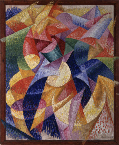
Sea = Dancer 1914
In this canvas you can see the movement of the sea within the curvaceous shapes. The use of dark and light tones allow for movement and a three dimensional effect. The dotted brush work creates movement. “The large curling planes are stippled with brilliant staccato dabs of paint that cause all surfaces to vibrate as if with light. (Barr 1936, 58)
Gino Severini has been said to be was the first of the futurists to come into contact with Cubism. Previous Cubism focused on a small number of objects, and “seldom cast its gaze on anything outside the painter’s studio”(http://blogs.smithsonianmag.com) The Futurists, on the other hand, were interested in the innovative life and inventions outside the studio, cars, trains and objects of modern life. Cubism now took new meaning rather than using fractured forms to analyse an object futurist used fragmentation to indicate “lines of force” to crate energy rather than a still object. Bold colour created the new style of cubism that was described as “drab in its coloration.” (http://blogs.smithsonianmag.com)
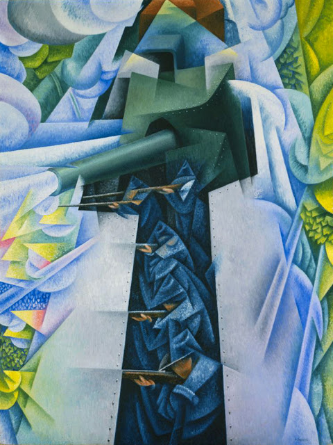
Armoured Train in Action 1915
Along with all futurists severini was obsessed by the mechanized war. You can see the five figures aiming gunfire in a linear pattern. Smoke from the canon is a solid strong shape, not so much casting a mask or smoke screen but swallowing the landscape within it the force. Futurists believed war could generate a new Italian identity one of military and cultural power.
Bibliography
Image sources
- http://www.ucd.ie/modernism/overview/p3.html
- http://ookaboo.com/o/pictures/picture/12871249/Après_la_Marne_Joffre_visita_le_front_en
- http://www.flickr.com/photos/laurapopdesign/3353688828
- http://www.twocoatsofpaint.com/2010/06/twitter-notes.html
- http://www.wright.edu/cola/Dept/eng/blakelock/rockweb2/rockpgs/R99/origindustrial2.htm
- http://theendofbeing.com/?attachment_id=11182
- http://collagemuseum.com/carra001.htm
- http://www.artline.ro/Carlo_Carra-19845-2-n.html
- http://www.midcenturia.com/2011/09/works-of-gino-severini.html
Text sources
- Alfred H. Barr, Jr., Cubism and Abstract Art (New York: Museum of Modern Art, 1936), p. 58.
- Helen Armstrong, Graphic Design Theory: Readings from the field, New York, Princeton architectual press 2009
Online sources
- http://www.getty.edu/art/exhibitions/tumultuous/ (Accessed 12/1/13)
- Bruce Sterling, November 11, 2008 http://www.wired.com/beyond_the_beyond/2008/11/manifesto-of-th (accessed 20/1/13)
- http://www.moma.org/collection/object.php?object_id=80009 (accessed 20/1/13)
- http://www.britannica.com/EBchecked/topic/96840/Carlo-Carra (accessed 20/1/13)
- http://blogs.smithsonianmag.com/art/2012/04/futurism-is-still-influential-despite-its-dark-side/#ixzz2IcHAAGwQ (accessed 20/1/13)
- http://serdar-hizli-art.com/modern_art_masters/manifesto_of_the_futurist_painters.htm ( accessed 21/1/13)
- J Widly, Sep 1, 2010, article: Futurism and umberto boccionis the city rises. Can b found at (http://suite101.com/article/futurism-and-umberto-boccionis-the-city-rises/) ( accessed 21/1/13)
